
Mission
A community volunteer group has come together to raise awareness about a rather unknown symbol of our city - our flag. A city wide contest was held where submissions arrived from elementary kids to proffessional artists! Through a community vote and a panel of “flag trained” judges, we arrived with our winner that represents where our city came from…and where we’re going! Click here to read about the symbolism behind the new flag.
Now it’s time to put the flag to use!
We want to see if flying above homes, businesses, used on Rochester made products, sewn onto backpacks and stuck to your laptops! We’ll be updating the site soon with options to purchase the new flag and download the art for you to use yourself! This is Rochester’s flag, this is your flag!
Why do we need a new flag?
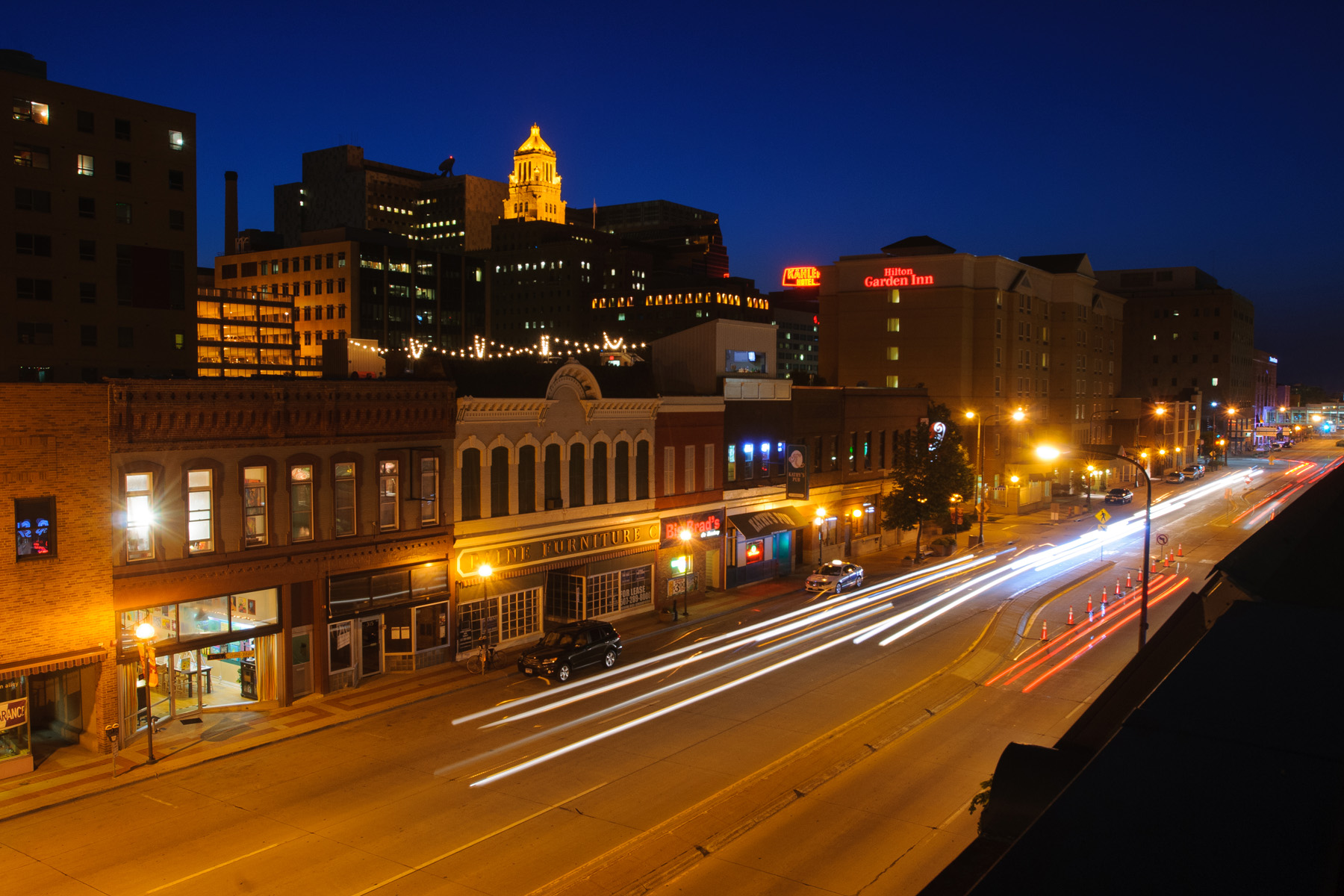
Did you know Rochester even has a flag?!
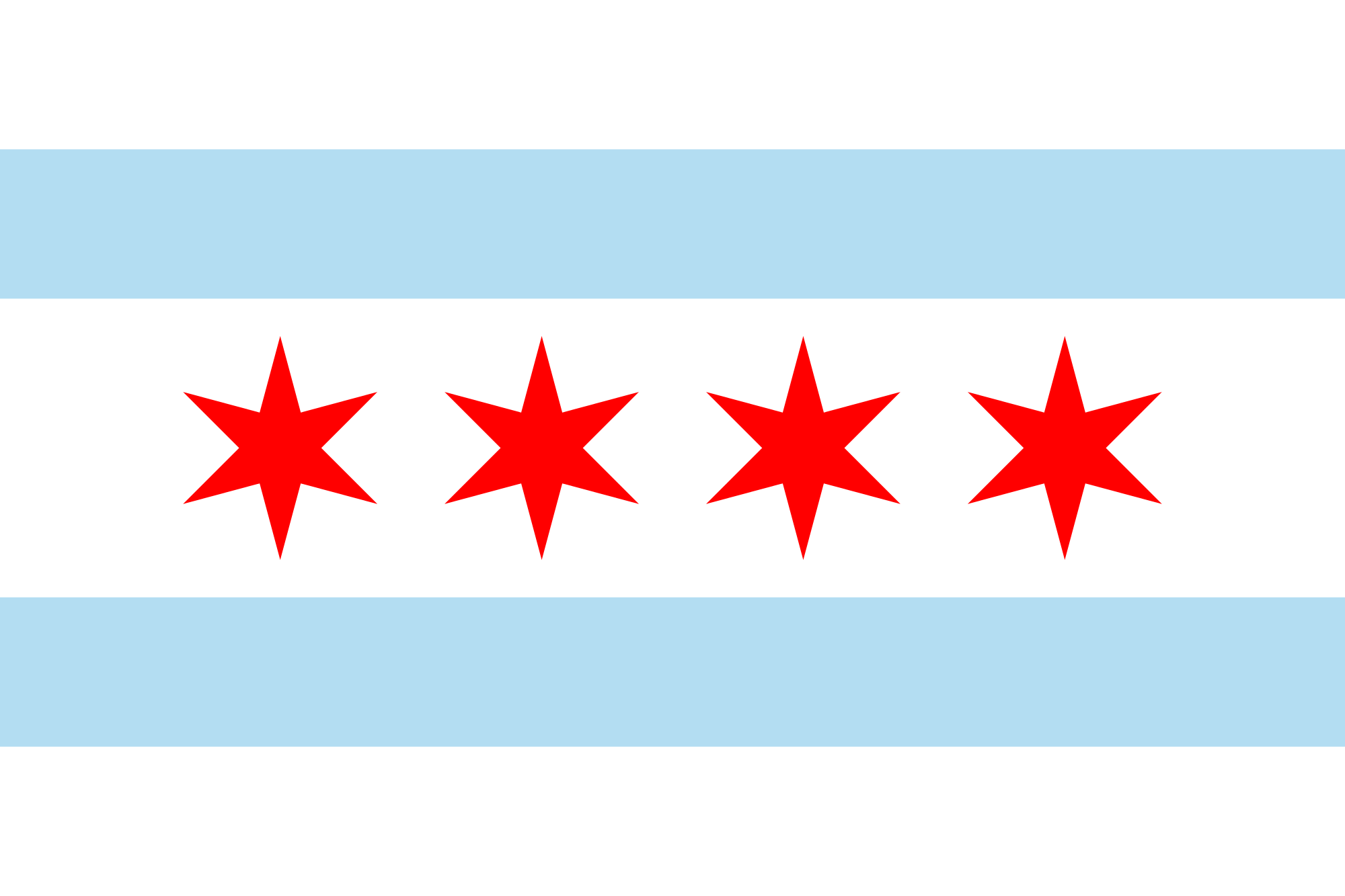
Probably not unless you've seen it as part of the recent news coverage...and that's the problem. A flag is a symbol of a city, a symbol of a community. Just as a logo is to a brand, a flag can be for a city. In cities and states that have wonderfully designed flags, you see them everywhere! From business windows, patches on backpacks, tattoos on forearms, designs on clothing, to of course flying on flagpoles! They stand out as iconic. They stand as a point of pride where one is from or even as a momento representing where one has traveled to. Most Minnesotans can more likely identify the flags of Colorado, Wyoming or California flying before that of Minnesota's - a seal with writing to small to see on a blue background flying 75 feet in the air, and unlike that of other state flags that have done the same uninspired "design."
The flag of Rochester suffers from similar issues - it's designed to be more of a seal, something you hold in your hand at close distance. Combined with the fact that it has intricately designed elements and text, it fails at the basic level of good flag design.
GOOD flag design
What makes "good" flag design...
We can't recommend enough, take 18 minutes of your day and be entertained/educated/inspired with this TED talk by 99% Invisible's Roman Mars.
1. Keep it simple
A child should be able to draw it from memory.
2. Use meaningful symbolism
The flag’s images, colors, or patterns should relate to what it symbolizes.
3. Use 2-3 colors
Limit the number of colors on the flag to three, which contrast well and come from the standard color set.
4. No lettering or seals
Never use writing of any kind or an organization’s seal.
5. Be distinctive or be related
Avoid duplicating other flags, but use similarities to show connections.
*Information from http://99percentinvisible.org/article/vexillology-revisited-fixing-worst-civic-flag-designs-america/